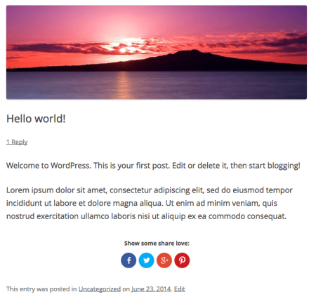
If you use Jetpack on your (self-hosted) WordPress site, you probably use the sharing buttons (sharedaddy) capabilities that Jetpack has. By default, these sharing buttons are shown at the end of your post following the content.
This tutorial will show you how to move Jetpack Social Sharing buttons elsewhere in your post, such as before your content. You can also check out this overview from the Jetpack team.
We’ll assume a couple of things:
- You can add custom code to your WordPress site correctly.
- If you want fine-grained control over this, you’re using a child theme (or if you’re using your functions.php for custom code). If not, check out this tutorial.
There are 2 methods that we could use: filtering the content and editing your post template.
Method 1: Filter the content
If you just want buttons before your post content, then you can move them there with the snippet below. In this example, I’ve scoped our function to only blog posts, as you may want to keep sharing buttons added at the bottom of the content for other post types. For example, you may be adding them to products, portfolios, etc., and we don’t want to interfere with those CPTs.
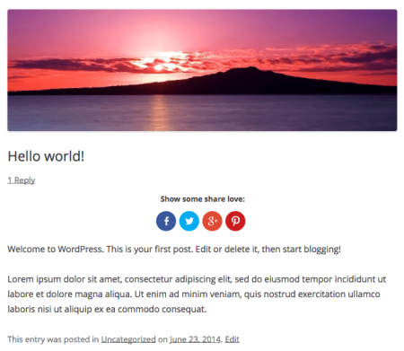
Now sharing buttons will be displayed before the post content instead:
Method 2: Edit the Post Template
There are a few steps to this method, but you’ll have more control over where the buttons are displayed. This can be useful if you already add something at the top of your content, and you want to display sharing after this.
1. Remove the Sharing Button Display
Let’s first add a code snippet to remove the automatic output of the sharing display. I’ve again scoped it to only blog posts.
function sv_remove_jp_sharing() {
    if ( is_singular( 'post' ) && function_exists( 'sharing_display' ) ) {
        remove_filter( 'the_content', 'sharing_display', 19 );
        remove_filter( 'the_excerpt', 'sharing_display', 19 );
    }
}
add_action( 'loop_start', 'sv_remove_jp_sharing' );
2. Change the Content Template
We’ll now need to edit the content-single.php file if you have it, or the content.php file. This really isn’t a step, unless you’d like to override the file.
If you’d like this change to be more upgrade-proof (useful for themes that are updated frequently), you can override the content.single.php or content.php file in your child theme by copying this file from the parent theme to the child theme folder. You can then edit the child theme’s file instead, and you won’t lose these changes when updating.
However, you should keep up with updates to your parent theme so you don’t miss cool stuff if it’s added!
3. Add Sharing Buttons to the Post Template
So let’s return to this file (be it in your parent theme or child theme). Now we’ll add the sharing buttons exactly where we want them. We’ll use the following snippet to do so:
<?php if ( function_exists( 'sharing_display' ) ) { echo sharing_display(); } ?>
Insert this where you’d like your sharing buttons to show up. If you want this added before the post content, then you’ll need to insert it after the header content but before the entry content (but I prefer Method 1 for this scenario). Pay attention to the <?php tags within the template; if you’re adding it to a PHP section already, you won’t need the opening and closing PHP tags.
This can allow you to add the sharing buttons after a particular element in the post content if desired. Once you’ve added the sharing output manually to your post template, you’ll see your sharing buttons displayed again.


thnkyuw so much i’m using it on my site.. http://www.droidopedia.com but i have a issue using the code i’m unable to remove bottom share button auto generated by jetpack??
I have activated sharing in jetpack but i may have a problem. When i click on a social button, it opens link in new tab instead of a pop-up. Please help me resolve this issue….!
Where do I place the code that you suggested to move the social icons to the top of the post? Since this is not css format I didn’t think the child theme was the appropriate location.
Trying to figure out how to place the icons to the right of meta entry. Every instruction online says how to move it above content but this just pushes content down and makes a big space on the top right. Any ideas where I can place the code to display the buttons float right of the meta entry?